
Introduction
To comply with WCAG 2.0 accessibility guidelines, the navigation and links on your website must be created with a specific structure and context. Hyperlinks are the main navigational features on a website and allow the user to easily move from one page (or section of a page) to another. This article will explain how to create clear, readable, and visually distinct keyboard accessible navigation menus and hyperlinks so that users can easily navigate your website.
Welcome
If you’re feeling lost or are new to web accessibility, the following articles will help contextualize the content within this article:
Navigation
Navigation menus are what help the user understand the underlying structure of a website. The main two functions of a navigation menu are:
- to tell the user where they are
- to enable the user to go somewhere else
Providing navigation in multiple ways is a good way to make sure that all users can choose the best way for them to find the pages that they’re looking for. Some users may find it easier to use the search box to find specific content instead of navigating through a large menu. Other users may prefer to use a site map. Some may want to use the large visual navigation menu with dropdowns to find the page they are looking for.
Best Practices for All Types of Navigation
- Wrap your links in a
<nav>tag and have an ARIA label ofrole=“navigation“. - Optionally, attach an aria-label attribute to the
<nav>tag to even more clearly explain to assistive technology users the purpose of the navigation. This could be helpful if you have multiple navigation menus. - Put your links within an unordered list.
- Code all navigation links using link tags
<a href="www.example.com"></a>.
Best Practices for Mobile Navigation
Hamburger buttons, which are usually defined as three thick lines (which resemble a simple top and bottom bun with a patty inside, hence “hamburger”),  are now used to signify that a larger navigation menu is behind it.
- Make sure that the user knows the hamburger button is a mobile navigation trigger. You can do this by giving it an ARIA attribute of
role="button“. - If the button is only an image, icon or vague text, it is recommended to add an ARIA label attribute explaining that the icon is the mobile navigation trigger, such as
aria-label="Open Menu". - Adding an ARIA expanded attribute can let the user know that something has been opened:
aria-expanded="false"when your menu is closed andaria-expanding="true"when the menu is open. This can be added via a programming language called JavaScript so ask your Web Development Team if this is something that should be added. - The actual links and structure of the menu behind the hamburger menu should follow the best practices for all types of navigation as outlined above.
Keyboard Navigation
Wherever possible, content must be operable through a keyboard or keyboard interface. Keyboard navigation is important to ensure every user has access to information without a mouse. Users should be able to tab to navigate between links and activate a link by pressing “Enter” on the keyboard. They should be able to activate hover and focus states with either a mouse or a keyboard. A few important things to focus on to have successful keyboard navigation are:
-
Keyboard Focus
Keyboard focus allows for a visual cue of where a user is on a webpage. For a detailed explanation of focus states and styles please refer to Hyperlinks: Focus States & Styles
-
Tab Order
Users must be able to tab through all elements on a webpage in a logical order. Usually this is from left to right, top to bottom. If your elements are properly ordered on a webpage with best coding practices followed, the proper navigation will be followed via the tabbing order. It is very simple to test tab order. Go to your page and use the tab key on your keyboard to go through all the elements on the page. Does each tab hit each element from left to right and top to bottom? Are all elements that should be focused on properly focused when tabbing through the page?
-
Avoid Keyboard Traps
Keyboard traps are when a user is prevented from further navigating a page. This can happen when a user is interacting with a complex interactive element, such as a date picker or calendar input field. The user will become unable to go to the next item using the tab key or unable to close an item using the escape key. It is important to test this type of functionality and let your web designer or developer know that there are accessibility issues preventing a user from navigating the page.
Validating Keyboard Accessibility
The best way to test keyboard accessibility is to manually test it yourself. When testing, ask yourself the following questions (answer ‘Yes’ to all of these and your page is accessible via keyboard):
- When using the tab key only, can you navigate all interactive elements (links, buttons, input fields etc.) on the page?
- Does the tab order match the logical order of the page (usually left to right, top to bottom)?
- Do all elements show a visual keyboard focus and not just with colour?
- Do you become trapped in an element at any time?
To learn how to properly operate a website using only a keyboard, Web Accessibility In Mind (WebAIM) has a great instructional table with all the keystrokes a keyboard user will typically use when navigating a website.
Visit WebAIM Standard Keyboard Shortcuts TableHyperlinks
Meaningful Link Text
When creating hyperlinks, your link text should be meaningful and not ambiguous. It should describe where the user is being sent and should make sense out of context.
Because AODA only requires that we meet level AA of WCAG 2.0 guidelines, this means that meeting Criterion 2.4.4 Link Purpose (In Context) is sufficient. This criterion says that if a hyperlink’s purpose can be determined by the link and the context of the sentence it’s in, then it meets this criterion. It is recommended that the link’s context precedes the link within the sentence it’s in. A valid example of this would be, “To visit our online store, click here.” While click here is not enough to understand the link, the sentence that precedes it explains it.
Link text should describe its purpose and destination. Assistive technology can provide users with a list of links that are on a specific webpage instead of reading through the entire page. If you think about this when creating links, a list of ‘click here’, ‘view this’, ‘click this link’ would not be highly informative to the user. Meaningful link text will help all users choose which links to follow without having to result to complicated strategies when viewing a webpage. We encourage you to meet Criterion Link Purpose 2.4.9 (Link Only) whenever possible. This is a level AAA criterion.
Example of Criterion 2.4.9 (Link Only)
Fail
Niagara College will be offering visits and tours throughout the holidays. Three types of tours will be available: wine, beer, and chocolate. Registration is required. To learn about visits and tours click here. To register click this link.
Pass
Niagara College will be offering visits and tours throughout the holidays. Three types of tours will be available: wine, beer, and chocolate. Registration is required. To learn about visits and tours, click here.
Principle 2: Operable / Guideline 2.4: Navigable / Criterion 2.4.4: Link Purpose (In Context)
Principle 2: Operable / Guideline 2.4: Navigable /
Criterion 2.4.9: Link Purpose (Link Only) (Level AAA)
Readable Hyperlinks are Friendlier Hyperlinks
Hyperlinks are often a long, complicated string of numbers, letters and symbols, which can be extremely hard to interpret for assistive technology like screen readers. Instead of forcing a user to listen to a long string of letters and slashes, use clear and descriptive text to explain the information the user will be brought to if they click on a link. For example, when we see www.niagaracollege.ca, a user that can see the link can see the words “niagara” and “college”, but a screen reader is going to read the URL letter-by-letter, which is not something that can be easily understood. See the table below for a clear example of Unreadable vs. Readable Hyperlinks.
Example of Unreadable vs Readable Hyperlinks
Unreadable
For domestic awards and scholarships visit https://www.niagaracollege.ca/enrolmentservices/financialaid/scholarships/domestic/ to learn more.
Readable
To explore scholarship and awards for domestic students visit the Domestic Scholarship and Awards Finder Tool.
Principle 2: Operable / Guideline 2.4: Navigable / Criterion 2.4.4: Link Purpose (In Context)
Links to Files
When linking to files (PDFs, Word documents, Excel files and so on), it’s recommended that the file type be included in the link text. For example, to provide a link to a form in PDF format the hyperlink might be Download Form A6 (PDF). This helps the user understand the link’s purpose.
Principle 2: Operable / Guideline: 2.4 Navigable / Criterion: 2.4.4 Link Purpose (In Context)
Consistent Text
If there are multiple links to the same place on a webpage – especially if they are physically close on the page – they should have the same or similar text labels. We want to ensure that, to anyone using a screen reader, it’s clear that both links go to the same location.
Titles of pages and the links that they are associated with should also be consistent. Having the link that the user clicks on be exact, or very similar, to the page title is good practice and provides cohesion between the link clicked and the page the user lands on. Consistency between a linked page title and link text is only a recommendation but it’s in line with the Criterion 2.4.2 Page Titled to allow the user to quickly and easily identify whether the information on the webpage is relevant to their needs.
Principle 2: Operable / Guideline: 2.4: Navigable / Criterion: 2.4.2 Consistent Identification
Principle 4: Understandable / Guideline: 3.2: Predictable / Criterion: 3.2.4 Consistent Identification
Make Hyperlinks Visually Distinct
Hyperlinks should stand out from standard text and should not rely on colour as the only way to make a hyperlink different from surrounding content. Criterion: 1.4.1 Use of Colour states colour cannot be used as the only visual means of conveying information, and this includes hyperlinks.
WCAG 2.0 does recommend that underlines should be reserved for hyperlinks only. Using underlines for hyperlinks gives no doubt to the end user whether the content is hyperlinked or static. Do not use underlines within the body of your text. Note that when creating your content, you do not need to manually underline hyperlinks.
Principle 3: Understandable / Guideline: 1.4: Distinguishable / Criterion: 1.4.1 Use of Colour
Principle 3: Understandable / Guideline 3.2: Predictable
Meet Colour Contrast Compliance
Hyperlinks must have enough colour contrast between the link and the background it sits upon. By using sufficiently contrasting colours, fonts will be properly visible for all users who visually read content on a webpage. The easiest way to be colour contrast compliant is to use black text on a white background or vice versa. However, Criterion: 1.4.3 Contrast (Minimum) states the contrast ratio must be at least 4:5:1.
Here are some examples of text with almost exactly 4.5:1 contrast.
- Gray (#767676) on white
- Purple (#CC21CC) white
- Blue (#000063) on gray (#808080)
- Red (#E60000) on yellow (#FFFF47)
For many of us, some of these combinations are not very readable. That is why 4.5:1 is the minimum required by WCAG. If you are not sure if your colours meet the minimum contrast requirements – don’t worry – there are many tools on the internet to help you make sure you are meeting minimum contrast.
Colour Contrast Validation Tools
Color Contrast Accessibility Validator
https://color.a11y.com/ is a Color Contrast Accessibility Validator where you can put the webpage url into the tool and get instant feedback on whether your contrast passes or fails.
WebAIM Contrast Checker Tool
Another tool to meet colour contrast requirements for hyperlinks is to use the WebAIM Contrast Checker tool. The tool allows you to enter your foreground and background colour and check whether the contrast passes or fails. This tool allows you to use a colour wheel to select a colour, or you can you include the hex colour code.
How do I get the hex colour codes that I need for the Contrast Checker tool?
Our Colour and Contrast article has instructions, learn how to get hex colour codes now.
Remember, our goal is to meet level AA contrast requirements.
Focus States & Styles
Keyboard-only users must press the tab key to navigate through interactive elements, including hyperlinks. It’s very important that all hyperlinks have a focus state, so the user knows which element is currently focused on the keyboard.
A focus state is a visual indicator — such as a dotted or solid box around a link or other focusable element — that shows the user’s location on a webpage. Each browser (Chrome, Firefox, Edge) has a different default focus style. Some have a dotted thin line or a faint blue outline around the hyperlink when it is in a focus state.
The image below shows the different states (default, hover and focus) for a hyperlink and a button. Your web development team may style these states differently than the image; however, this gives an example of the type of focus states and styles you may see on websites.
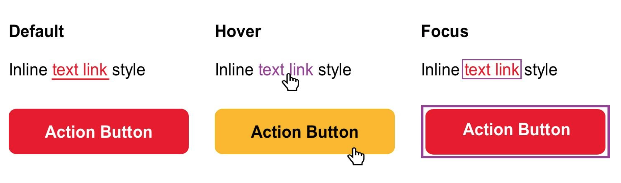
It is recommended that custom focus styles should be created when you are designing a webpage. If you are unsure if the Content Management System you are using has custom focus styles, contact your web designer or developer.
Adjacent links
Adjacent links lead to duplication for some assistive technology users. This happens when there is content on a page that has multiple elements linking to the same page. It is beneficial for all users to have any links that are going to the same page or resource to be combined into a single link. It helps reduce the number of elements to navigate and reduces screen reader verbosity.
An example of what adjacent links are and how to fix them has been included below to help illustrate how to fulfill WCAG 2.1 success criterion. In the example image below, there is an image tag and a header tag. In the ‘Adjacent Link HTML Markup’ column there are link tags around both the image and the heading tag and they are both the exact same link. This is considered a violation of WCAG 2.1, as a screen reader will now have to read the same link twice. To make this compliant, you should wrap both the image and heading tags within the anchor/link tag. Refer to the ‘WCAG 2.1 Compliant Markup’ column for the correct html markup. This will allow for only one link to be on the page instead of the original two. It also allows for a larger clickable area, making it easier for all users to click or keyboard navigate to the link. It is also important to note that the image does not require alt text when it is wrapped within a link, since screen readers will have to read that alt text and it is unnecessary.
Example of Adjacent Links

Adjacent Link HTML Markup
<a href="https://www.niagaracollege.ca/programs/"><img src=”https://www.niagaracollege.ca/images/25009-apply-now.jpg" alt=”two students with arms stretched out smiling against graffitied wall” ></a><a href="https://www.niagaracollege.ca/programs/"><h2>Selecting a program is an important step on your path to your future.</h2></a>
Readable
<a href="https://www.niagaracollege.ca/programs/"><img src=”https://www.niagaracollege.ca/images/25009-apply-now.jpg" alt=””><h2>Selecting a program is an important step on your path to your future.</h2></a>
Links opening in a new tab/window only when necessary
Opening a new tab or window may seem like a good idea, however, it can be disorienting for the user, especially anyone who has difficulty perceiving visual content. Consider the scenario where a user doesn’t know or understand that they are now in a different tab. A user tries to hit the back button on the keyboard to return to the previous page, but nothing happens. We recommend only opening links in a new tab or window when necessary. Exceptions to this rule would be when navigating the current tab or window would be disruptive to the user experience. Examples of this are:
- User is filling out a form and clicks a link on the page to get further instructions. Opening this in a new tab is beneficial because then the user will not lose their data before submitting the form.
- Opening a completely different website than the one the user is currently navigating.
NOTE: please be aware that opening links in a new tab/window is not a success criteria, the WCAG 2.0 AA standards recommend limiting the number of links and buttons that open in new tabs/windows.
Techniques for WCAG 2.0 / General Techniques / G200: Opening new windows and tabs from a link only when necessary
How to inform users of new tab/window opening links
The most straightforward way to inform the user of a new tab/window opening link is to put it right into the link text. For example, if your link text is currently “Visit Ontario Colleges for more information”, you could change this to read “Visit Ontario Colleges for more information (opens in new tab)”.
If you would not like the extra text within your link you could also make it only available to screen readers and other assistive technology by using an html class. Take the link code example below, where the CSS code will allow you to hide the text that is in the <span> code in the HTML Code example.
Example of Adjacent Links
HTML Code
<a href="https://example.com" target="_blank">
  Visit Ontario Colleges for more information
  <span class="screen-reader-only">(opens in a new tab)</span>
</a>
CSS Code
.screen-reader-only {
  position: absolute;
  width: 1px;
  clip: rect(0 0 0 0);
  overflow: hidden;
  white-space: nowrap;
}
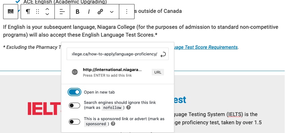
How to add an open in new tab/window link
If you are using the Gutenberg editor for WordPress, highlight the text you would like to make into a link and select the link button from the block’s toolbar.
The link box will appear and then you can add your link and toggle the ‘Open in new tab’ button to active. This will allow your link to open in a new tab. If you would like you can add text such as ‘(opens in a new tab) to your text.
Skip Links and Anchors
Skip links and anchors are elements that are used to help users who navigate websites sequentially have more direct access to the primary/important content on a webpage. An example is when you click on a link and then get instantly moved to somewhere further up or down on a page.
Webpages often have content that appears on other pages, a great example of this is the navigation menu of a website. Users who navigate a website with a keyboard, or other assistive devices, will have to go through, or listen to, the same navigation menu on every page if there is no skip link in place to bypass the navigation menu.
Repeated blocks of content are elements such as navigation links, heading graphics, and advertising frames. Individual words, phrases or single links are not considered large enough elements to need to have skip links used for them.
First link on the page: “Skip to Main Content”
When navigating a website with a keyboard, or other assistive device, it is recommended that the first link on the page is a skip link called something like “Skip to Main Content”. The reason for this is so users who are navigating your website will have the choice to not have to go through all navigation and header content over again. This successfully meets with Criterion 2.4.1 Bypass Blocks and it is important to note that the criterion does not require that they be visible when they do not have focus.
Principle 2: Operable / Guideline: 2.4: Navigable / Criterion: 2.4.1: Bypass Blocks
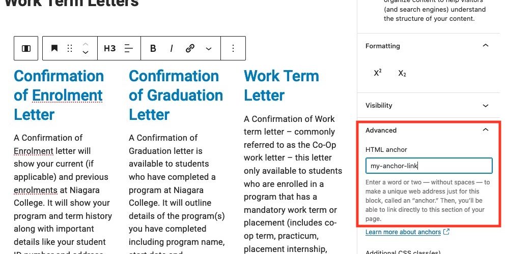
How to Add Skip Links and Anchors
If you are using the Gutenberg editor for WordPress, select the block you would like to set an anchor for and click on “Advanced” from the right-hand side. Then enter the anchor text in the “HTML Anchor” box.
HTML Anchors have a very specific format they must follow. Below are a few rules to make sure you create proper anchors:
- HTML Anchor must be unique within a document.
- HTML Anchor is case-sensitive.
- HTML Anchor can include following symbols: hyphen(-), underscore(_), colon(:), period(.). It cannot include space.
- HTML Anchor must start in the alphabet.
Linking to your HTML Anchor
Now that you have created your HTML Anchor you must link to it somewhere on the page. Follow the instructions below to add a link using the Gutenberg editor for WordPress:
- Type some text, add an image, or button that will become what you want the user to click on to go to your anchor linked section.
- Highlight the text, image, or button, and select the link option from the block’s toolbar.
- Type in the HTML Anchor that you created, starting with the pound (#) symbol. For example, if the anchor you created was called “my-anchor-link” you would put “#my-anchor-link” in the link input box.
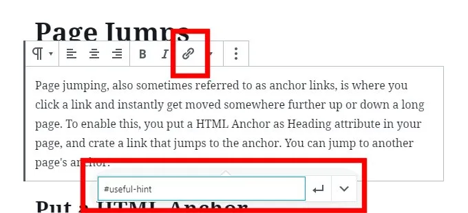
NOTE: if you want to jump to an anchor on another page, you must make sure you include the whole url with the HTML anchor in the link input box.
Example of an anchor on the same page: “#my-anchor-link”
Example of an anchor on a different page: “www.niagaracollege.ca/articleonotherpage/#my-anchor-link”