
Welcome
If you’re feeling lost or are new to web accessibility, the following articles will help contextualize the content within this article:
- What is the AODA?
- Introduction to Web Accessibility
- WCAG 2.0 At a Glance
- Introduction to Writing and Formatting Content – This article directly introduces many concepts discussed in the Formatting Content article.
The below content explores the best methods of accessibly marking up your content within a WYSIWYG editor.
To make this article easy to understand and follow, related principles, guidelines and criteria have been noted at the end of each section.
Semantic Markup
Understanding and applying semantic markup correctly is critically important to website accessibility. Without semantic markup, websites would be missing important elements that adaptive technologies need to work properly.
What is semantic markup?
When content is formatted using a WYSWYG editor semantic markup is being created.
Semantic markup is the use of HTML (Hyper Text Markup Language) to convey information about content on a web page. HTML provides semantic tags which are wrapped around text. These tags provide important information about that content’s purpose to browsers (ex. Chrome), screen readers, and other adaptive technologies.
There are semantic tags and non-semantic tags. Semantic tags always convey meaning, while non-semantic tags are used only for the design or layout elements on a web page.
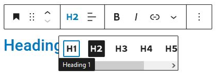
One of the most important semantic tags are heading tags. There are 6 levels of headings: H1, H2, H3, H4, H5 and H6. H1s are the most important heading on a webpage, H2s are the next most important, H3s the next, and so on.
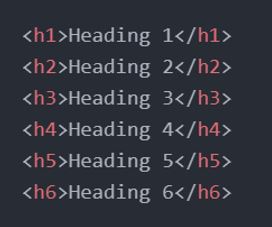
Code View of Headings
Browser View of Headings
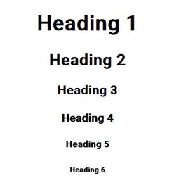
By surrounding text with semantic heading tags, the browser converts the text into headings of 6 different visual sizes. In modern web design, and to meet accessibility guidelines, we must choose our headings based on hierarchy rather than visual presentation.
Learn more about headings in the Headings section below.
Using WYSWIYG Editor Tools is Key

When a WYSIWYG editor is used to format headings, the text you select is being wrapped in the appropriate level HTML tag. This is why it’s critically important to use WYSIWYG tools to markup your text. If you were to bold your text or write it in all capital letters instead, the semantics of the text content would be completely lost. They’d be lost not just to your browser and how the heading looks on-screen, but to screen readers, assistive devices, and even the search engines that visit your page. This same concept can be applied to the other semantic markup elements that are covered below.
Semantic Markup vs. Visual Presentation
The website environment you’re working in — that is, the theme, styling, or templating that you are using — will impact the look of headings and other semantic elements. In many cases, styling options may be unavailable to you or locked out.
You may find that choosing hierarchically correct formatting creates content that looks visually poor due to issues with sizing or spacing. We encourage you to reach out to your web developer to come to a solution for any visual problems that arise, as it’s tremendously important to retain correct semantic and hierarchical formatting for accessibility purposes.
Important: Without semantically marked up content, adaptive technologies cannot see or convey the existence of different types of content.
Principle 4: Perceivable / Guideline 1.3: Adaptable / Criterion 1.3.1: Info and Relationships
Hyperlinks
For more information about hyperlinks please read the Hyperlinks and Navigation article.
Semantic markup is a must
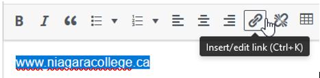
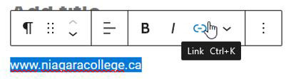
Website URLs and email addresses should always be marked up as hyperlinks. They should not be plain text. For example, www.niagaracollege.ca or niagaracollege.ca should be www.niagaracollege.ca or niagaracollege.ca.
When a website URL or email address is marked up as a link, the <a> tag is applied, which tells browsers and screen readers that it is a link. Additional information can be passed in the <a> tag — like whether the link should open as a new page or tab, or if an email client should be launched.
Principle 4: Robust / Guideline 4.1: Compatible / Criterion 4.1.2: Name, Role, Value
Opening links in new tabs
This criterion is advisory only as it is level AAA. It is recommended that links open in a new tab only when necessary, as this is disorienting to many users. An example of a necessary situation would be opening a page containing instructions in a new tab that would otherwise disrupt a workflow (like filling in a form).
Principle 4: Understandable / Guideline 3.2: Predictable / Criterion 3.2.5: Change on Request
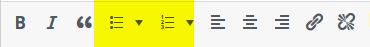
Lists
Bulleted lists show related items and can help break up large blocks of text. Numbered lists show steps in a process or sequence. Be sure to use the right type of list for your content.
Both bulleted lists and numbered lists must be marked up using the appropriate WYSIWYG editor tool.
Do not manually create lists bulleted using hyphens, dashes, or asterisks. Do not manually create numbered lists using numbers, letters, or roman numerals. For example:
* Horse
* Dog
* Cat
* Mouse
i. Horse
ii. Dog
iii. Cat
iv. Mouse
Beware of bulleted list imposters
Can you tell the difference between a semantically marked up bulleted list and a bulleted list imposter?
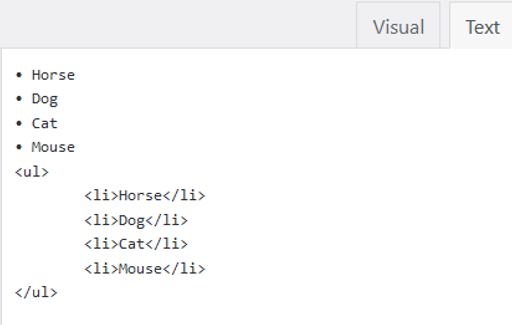
When you created a bulleted list within a WYSIWYG editor, it is marked up using the following HTML code:
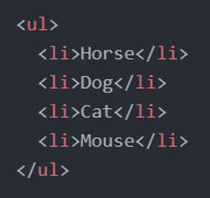
The <ul> and </ul> denote the start and end of an unordered list.
Each <li> and </li> denotes the start and end of a line item. This creates the bulleted list that you see on screen. It also helps define the start and end of bulleted lists and line items for adaptive technology.
If you created a bulleted list in Microsoft Word and then paste it into a WYSIWYG editor, the editor will automatically markup the list with this code.
In some situations, a list’s HTML tags can get lost. In its place would be a list which retains its visual bullets but has lost its underlying semantic markup. This often happens when a list is copy/pasted into a plain text application like Notepad.
The bullets have come along for the ride, but the semantic markup has been removed.
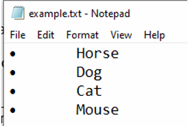
If this list is copy/pasted back into a rich text application like a WYSWIYG editor or Microsoft Word, you’ve got a bulleted list imposter.
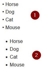
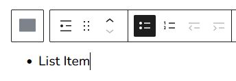
Here is a screenshot of 2 bulleted lists in a WYSIWYG editor. Do you know which one is the imposter?
It’s #1! The giveaway is the small bullet points.
By switching to HTML view within the editor, we can see which one has been semantically marked up (#2), and which one hasn’t been (#1).
Principle 1: Perceivable / Guideline 1.3: Adaptable / Criterion 1.3.1: Info and Relationships
Bold and Italics
When marking up text to be bold or italicized, modern Content Management Systems use 2 special semantic tags rather than the classic bold (<b>) and italics (<i>). Instead, they use strong (<strong>) and emphasis (<em>). If you are marking up your text using a modern WYSIWYG editor, <strong> and <em> will be used by default.
Note that <b> and <i> tags are still valid, but that there is no semantic association with them — they only change the text’s appearance.
WCAG 2.0 guidelines list the use of <strong> and <em> rather than <b> and <i> as a technique to meet the 1.3.1 Info and Relationships success criterion. In theory, using these tags allows special text to be programmatically determined by adaptive technology, but the reality of how screen readers treat these tags is complicated. This success criterion was developed with the assumption that screen readers should read aloud <strong> and <em> tags with a different tone or voice and should ignore <b> and <i>. In reality, both types of tags are usually ignored by screen readers unless the user manually changes their settings. Users report that these types of tags are distracting (Teh, 2015), and usually keep this feature turned off (Underhill, 2021).
For this reason, how bold and italics/strong and emphasis are used (or not used) specifically related to screen reader requirements is not critical. However, both bold and italics should still be used sparsely and thoughtfully, as legibility can be impacted for other users.
Principle 1: Perceivable / Guideline 1.3: Adaptable / Criterion: 1.3.1 Info and Relationships
Headings

There are 6 levels of semantic headings that can be marked up: H1, H2, H3, H4, H5 and H6. Headings are ranked 1 through 6, with 1 being the most important, and 6 being the least important.
- Headings must be marked up as headings.
- Do not use all caps, bold or italics instead of heading tags.
- The title of your website should be the only H1 on the page. Your page title would typically be H2, followed by H3s for the titles of sections, and H4s, H5s and H6s for sub-headings within those sections.
- Headings are hierarchical. Do not skip headings from small to large (ex. H2 to H4).
- Headings must be selected based on hierarchy and not appearance.
In the following examples, each list item represents a heading on a page. Heading levels have been indicated after each. For demonstration purposes, headings have been visually sized and arranged into an ordered list to better show hierarchical relationships.
Examples of Nested Headings
Example 1: Heading Hierarchy (Small Website Landing Page)
- Applebin Farms (H1) (Website Title)
- Welcome to Our Farm (H2)
- What We Sell (H2)
- Produce (H3)
- Vegetables (H4)
- Squash (H5)
- Squash Varieties (H6)
- Squash (H5)
- Herbs (H4)
- Vegetables (H4)
- Produce (H3)
- Workshops on the Farm (H2)
- Lavendar Candles (H3)
- Flower Arranging (H3)
- Contact Us (H2)
- Fonthill Farm (H3)
- Welland Farm (H3)
Example 2: Heading Hierarchy (Large Website Page)
On larger websites with sub-sites, all 6 levels of headings are used more often.
- Niagara College (H1) (Website Title)
- Health, Wellness and Accessibility Services (H2) (Sub-Site Title)
- Health Services (H3) (Page Title)
- Our Services (H4)
- Visit the Health Centre (H4)
- Make an Appointment (H5)
- Missed Appointment Fees (H6)
- Cancel an Appointment (H5)
- Make an Appointment (H5)
- Contact the Health Centre (H4)
- Health Services (H3) (Page Title)
- Health, Wellness and Accessibility Services (H2) (Sub-Site Title)
Which level of heading should I use?
It might not be obvious which heading should be used, since this will depend on what headings precede the heading that you wish to add.
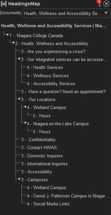
The HeadingsMap browser plugin generates a hierarchical list of headings, so you know exactly how your page is formatted, and which heading should be used.
- Chrome: https://chrome.google.com/webstore/detail/headingsmap/
flbjommegcjonpdmenkdiocclhjacmbi - Firefox: https://addons.mozilla.org/en-US/firefox/
addon/headingsmap/ - Edge: https://microsoftedge.microsoft.com/addons/
detail/headingsmap/bokekiiaddinealohkmhjcgfanndmcgo
Once the plugin is installed, visit any page and activate the HeadingsMap button in your browser’s toolbar.
Alternately, a web designer or developer can tell you the most appropriate heading to use.
Principle 1: Perceivable / Guideline 1.3: Adaptable / Criterion: 1.3.1 Info and Relationships
Text Justification
- Use left aligned text whenever possible.
- Only center align text as needed for visual emphasis, like a slogan or motto. Center aligned text should only be 1-2 sentences long.
- Do not use justified text (when text is aligned to both the left and right margins).
Using justified text is a failure of a level AAA criterion, but it is an easy guideline to meet. When text is justified it adds more space between words to ensure that words always align perfectly with left and right margins. This looks visually awkward and can cause serious legibility issues for users with dyslexia and those using screen magnification tools.
Two examples of justified text have been provided below. Take note of the large white spaces within the text that create distracting rivers of white space. In the second image, the rivers have been added with a blue line to make them easier to distinguish.
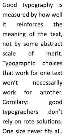
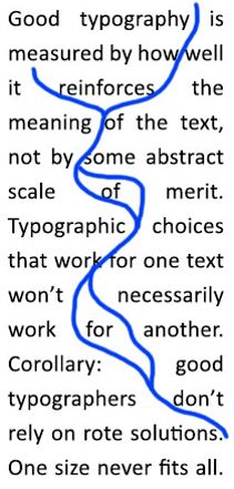
Text used the examples above from Butterick’s Practical Typography.
Principle 3: Understandable / Guideline 3.1: Readable
Principle 1: Perceivable / Guideline 1.4: Distinguishable / Criterion 1.4.8: Visual Presentation (AAA)
Use of White Spaces
White spaces are the use of keys on your keyboard — tab, spacebar, enter — to add spaces, tabs, and carriage returns.
- White spaces should not be used to format content.
- White spaces should not be used to add spacing within words.
- Do not add two spaces after sentences. This practice is dated and was used for typewriters, which used monospaced typefaces. Modern computer typefaces are proportional. Learn more about monospaced vs proportional fonts.
Use the layout options within your web authoring environment — like columns, or tables for tabular data — to lay content out.
Using white spaces incorrectly has wide ranging impacts, including:
- When white spaces are used to format content, assistive devices cannot read content in a meaningful way.
- When extra spaces are used after sentences, the creation of rivers of white space through blocks of text makes it difficult to read for users with dyslexia.
Examples of Criterion Failures
Columns of Text
The spacebar and enter button have been used to format content into a shopping list with columns in the example below. This is an example of what not to do.
Dairy Bakery Pantry
milk bread chickpeas
eggs muffins soup
butter salt pasta
Meat Cleaning
steak dish soap
Notice that the spaces between the words above can be highlighted. These are white spaces. A screen reader has no concept of how this text is laid out and will read it line by line:
- Dairy Bakery Pantry milk bread chickpeas eggs muffins soup butter salt pasta Meat Cleaning steak dish soap
Spaces in Words
Do not add white spaces within words, for example: w e l c o m e.
Principle 1: Perceivable / Guideline 1.3: Adaptable / Criterion: 1.3.1 Info and Relationships
Principle 1: Perceivable / Guideline 1.3: Adaptable / Criterion: 1.3. Meaningful Sequence
Tables
This subject is complex, and a separate article has been created to address it. Learn more about Accessible Tables.
Keep it Simple
Avoid using too many styles when creating and editing web pages. In most cases, theming and styling will be set in advance for website content editors authoring pages within a structured environment like a Content Management System. If it isn’t, we recommend that you follow these guidelines when creating web content:
- Use no more than 2 different fonts.
- Use standard fonts that are easy to read.
- If using a heavily stylistic font, use it sparingly, and make sure it’s legible on small screens and at small font sizes.
- If your web authoring environment allows you to change the colour of portions of text — don’t. If it’s absolutely necessary, only change a few words or a brief sentence, and be sure to check that it meets Colour and Contrast requirements. If you need to change the colour of text again on the same page, use the same colour that you did the first time.
Principle 3: Understandable / Guideline 3.1: Readable