
Welcome
If you’re feeling lost or are new to web accessibility, the following articles will help contextualize the content within this article:
- What is the AODA?
- Introduction to Web Accessibility
- WCAG 2.0 At a Glance
- Introduction to Writing and Formatting Content
- Writing Content
- Formatting Content
The information on this page has been written with web content creators in mind. In some cases, where we’ve determined that it’s important for you to understand how something works, more advanced guidelines have been included so you can make informed accessibility choices during content creation.
Who does these guidelines help?
- Users with colour blindness.
- Users with partial sight.
- Users with limited colour, monochrome, or text-only displays.
Use of Colour
- Principle 1. Perceivable: Information and user interface components must be presentable to users in ways they can perceive.
- Guideline 1.4 Distinguishable: Make it easier for users to see and hear content including separating foreground from background.
- Criterion 1.4.1 Use of Colour: Colour should not be used as the only visual means of conveying information, indicating an action, prompting a response, or distinguishing a visual element. If the colour of a page element is used to indicate information, that same information should also be conveyed in another way.
Example Scenarios for Use of Colour
The below table demonstrates typical failures of the Use of Colour Criterion, along with a suggested fix to meet the criterion. There may be other methods of sufficiently achieving this criterion. Detailed information, as well as other techniques, can be found on the WCAG Use of Colour Criterion page.
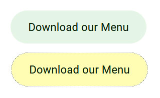
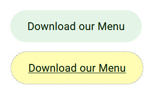
Example 1:
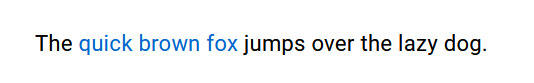
Incorrect
Hyperlinks are indicated with colour only.
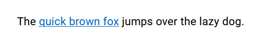
Correct
Hyperlinks are indicated with colour as well as an underline.
Example 2:
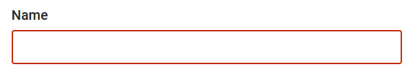
Incorrect
A required field in a form is only indicated by a colour change.
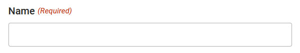
Correct
A required field in a form is indicated by the words Required as well as a colour change.
Example 3:
Incorrect
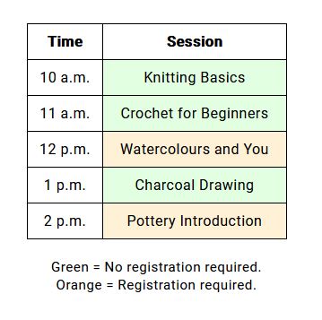
A conference schedule contains dates and times for sessions. Each cell is colour coded: green cells indicate an open session, and orange cells indicate that registration is required.
Correct
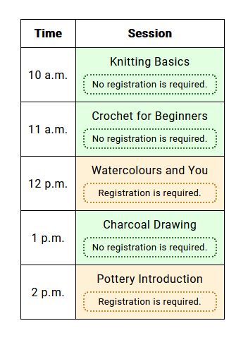
In addition to being colour-coded, each cell should contain text that says, “Registration is not required” or “Registration is required”.
Example 4:
Incorrect
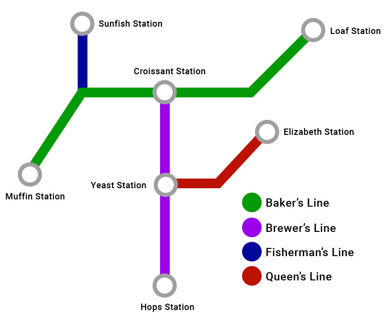
A map showing a subway system has the routes included in different colours, with a legend using the same colours to identify the route name.
Correct
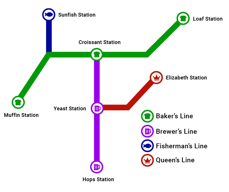
Stops on individual routes are indicated with symbols as well as colours. The same symbol is included in the legend for that route, along with the colour.
Example 5:
Incorrect
When navigating a website using your keyboard (by hitting tab), buttons that come into focus only change colour.
Correct
Add a distinct visual change to the link when it is focused. For example, on focus you could add or remove an underline, add, or remove a border, or add or remove an icon.
Example 6:
Incorrect
An image of 3 types of pens is included on a webpage. The rollerball pen has an X drawn over it in red.
The alternative text for the image says, “We sell 3 types of pens: pen with cap, twist pen, rollerball pen. Pens with a red X are sold out.”
Correct
The alternative text for the image should say, “We sell 3 types of pens: pen with cap, twist pen, rollerball pen. Twist pens are sold out.”
Colour Contrast
- Principle 1. Perceivable: Information and user interface components must be presentable to users in ways they can perceive.
- Guideline 1.4 Distinguishable: Make it easier for users to see and hear content including separating foreground from background.
- Criterion 1.4.3 Contrast: The criterion is outlined below.
The visual presentation of text and images of text must have a contrast ratio of at least 4.5:1, except for large text and logos. Large text must have a contrast ratio of at least 3:1.
Contrast refers to the colour contrast between foreground text colour and background colour. This includes text on a coloured background, as well as text that is laid over top of a background image.
The best way to meet colour contrast requirements is to use the WebAIM Contrast Checker tool. The tool allows you to enter your foreground and background colour and check whether the contrast passes or fails. Remember, our goal is to meet level AA contrast requirements. The tool allows you to use a colour wheel to select a colour, or you can you include the hex colour code.
Text on Images
For text on images, it might be difficult to determine if sufficient colour contrast is present because you will be comparing the foreground text colour against an image with (possibly) many background colours. Our recommendation is to sample the lightest or darkest colour in the image in the area below your text — whichever is opposite of the colour of your text — and use this as the background colour within the Contrast Checker tool. In some cases, determining sufficient colour contrast may be up to your discretion. Remember: if you find the text difficult to read, others will as well.
Images of text are discouraged based on the Images of Text 1.4.5 criterion. The below examples of images of text were produced specifically for this article, however in application, text on images should be added programmatically (ex. through a Content Management System text overlay feature).
Example Scenarios for Colour Contrast
Example 1:
Incorrect
The contrast in the below text example does not meet WCAG requirements.

Correct
The contrast in the below text example WCAG requirements. Darkening the background colour makes the white text legible.

Example 2:
Incorrect
The contrast in the below image example does not meet WCAG requirements. The text at the top of the image is not legible.

Correct
The contrast in the below image example meets WCAG requirements. A block of colour has been placed below the text to increase contrast.

Correct (Alternative Example)

Another method of solving contrast issues in images would be to choose images that have large blank areas of solid colour. Text of sufficient contrast can be added in these areas.
Tip: Keep in mind that text — when added programmatically — may shift around on different sized monitors. Be sure to shrink and expand the width of your browser window to see how the text reacts.
How do I get the hex colour codes that I need for contrast checker tools?
Use a browser plugin:
The easiest way to retrieve a colour code is to use a plugin like ColorZilla. ColorZilla allows you to use an eyedropper to select any colour on any webpage that you visit.
Use an online tool:
If you need to grab a colour from an image there are many online tools can be used. We suggest the RedKetchup Color Picker.
Use Adobe Photoshop:

If you have access to it, the eyedropper tool in Adobe Photoshop can be used to select a colour.

Once you have selected the colour, double click on the colour cards at the bottom of the toolbar.

The hex colour code will be available at the bottom of the window.
Ask a web designer:
A web designer or developer will be able to provide you with any hex colour codes that you need.