
Welcome
If you’re feeling lost or are new to web accessibility, the following articles will help contextualize the content within this article:
- What is the AODA?
- Introduction to Web Accessibility
- WCAG 2.0 At a Glance
- Introduction to Writing and Formatting Content
- Writing Content
- Formatting Content
For a website form to be WCAG compliant, it must also follow all WCAG guidelines for formatting of regular content. This includes but is not limited to proper heading structure, lists, paragraphs, and links. Please review the articles in the list above to make sure you have a proper understanding of formatting content guidelines.
The information on this page has been written with web content creators in mind. In some cases, where we’ve determined that it’s important for you to understand how something works, more advanced guidelines have been included so you can make informed accessibility choices during content creation.
What is a Web Form?
This article covers accessibility guidelines for website forms (“web forms”). A web form is a series of input fields which are embedded within a website. Web forms are submitted using a button at the bottom of the form and usually issue a confirmation that the form has been submitted. Web forms also include online surveys and polls.
This article does not cover PDF or Word forms (“digital forms”). Please review the articles within Document Accessibility for more information about digital forms.
Why Make Accessible Forms?
An online form represents one of the most complex interactions that a user can have with a website. Various components, fields, and options are combined to ask the user for complicated information, formatted in a specific way.
Forms can be difficult or time-consuming for a user to complete on a desktop computer. This complexity is compounded when accessing forms via an assistive device or user limitations are present (ex. use of keyboard only). For this reason, making a form accessible is something that all users benefit from. Investing the time to create a well-organized, highly usable form has the following benefits:
- Making a form accessible improves the layout structure, instructions, and feedback.
- Labels can be used via voice commands to activate controls and move the focus to fields that must be completed for users using speech input.
- Users can more easily identify and understand form controls because they are properly associated with labels and other structural elements.
- Accessibility and search engine optimization (SEO) are closely related. If content is easier to read for screen readers, it is also easier for search engines to read and index.
- If more people can fill out your form, then this increases the chances that more people will fill out your form. A better user experience overall can boost the conversion rate of your form whether you are trying to get someone to register for an event or to sign up for an email subscription.
How do I choose form building software?
Choosing form building software can be challenging even without the extra layer of accessibility. When selecting a form builder, you should read any accessibility articles or information on their website before downloading or purchasing software
Things to look for include:
- Look for claims that the form builder is WCAG 2.1 AA compliant (at the time of writing this is the minimum standard).
- Mention enhanced screen reader feedback for users.
- Keyboard usability.
- Ability to write enhanced error and validation messages.
Recommendations for form building software
If you are unsure about whether the form building software you have selected meets the criteria for accessibility, do not hesitate to contact your web development team.
I want to add a form to the Niagara College website
The NC Web Development team provides some support for the creation of on-site forms, depending on the form requirements and subject. Contact the NC Web Development Team through a ticket request and someone from the Web Development Team will reach out to you for more information.
I want to build a form through another service
Survey Monkey and Microsoft Forms are two form builders that create accessible forms. If you want to use another form builder, please refer to the information at the beginning of this section.
Survey Monkey
Survey Monkey has tips on their website on how to build accessible forms, including a checklist to ensure your survey/form is accessible using their software.
Learn More about Survey Monkey Accessibility GuidelinesMicrosoft Forms
Microsoft Forms allows users to create custom quizzes, surveys, questionnaires, and registration forms quickly and easily.
Forms created through Microsoft Forms are accessible and can be completed using a screen reader or with a keyboard. Microsoft has a support website for using accessible software with their Microsoft applications including Microsoft Forms. There is also documentation to build forms and quizzes using a screen reader. Microsoft has kept accessibility in mind for all users, both on the frontend and backend of their Forms software.
Accessibility Support for Microsoft FormsNeed to use a screen reader or keyboard to build a form?
We recommend using Microsoft Forms. If you are a Niagara College student or staff member, you have access to Microsoft Forms through MyNC.
- Log MyNC.
- Click on More Applications.
- Look for Microsoft O365. Click the MS Forms icon to access the MS Forms application.
Form Layout
Forms and other web page content are read in a linear order when using adaptative technologies such as screen readers. For this reason, each form component needs to be in the correct order. For example, placing an optional field after the submit button may prevent a screen reader from being aware that that option exists. This would result in the user submitting a form without being aware of all the on-screen information.
Use of Colour in Forms
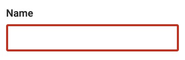
To comply with accessibility guidelines, the WCAG 2.0 Use of Colour and Colour Contrast criteria must be met. Colour should not be used as the only visual means of conveying information, and text on your form must meet minimum contrast requirements. For more information on this topic, we recommend reviewing the Web Accessibility article on Colour and Contrast. Below is an example of incorrect and correct validation and error messaging for a form field input.
Example of Use of Colour in Forms
Example:
Incorrect
A required field has an error in a form and is only indicated by a colour change.
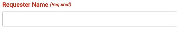
A label of the field ‘Requester Name (Required)’ in a red colour which will not give a user with colour vision deficiency any indication that there is an error for this field.
Correct
Hyperlinks are indicated with colour as well as an underline.
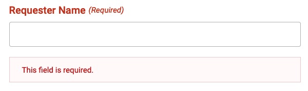
A clear text message beneath the form field stating the error as well as a colour change.
Field Labels
Using a label helps everyone to better understand how a field should be filled out. Labels should be named and placed in a logical order. Form fields must always have a text-based label indicating what information should be entered into a form field, or what a radio button/check box represents. Make sure that label text is clear and informative, telling the user exactly what input is required.
Labels should be associated with their form field for greatest accessibility. This will allow screen readers to properly tell the user what the field represents and takes any guess work out of the connection between label and input field.
Labels must be placed either above or to the left of the input field they are associated with.
Example:
Radio buttons and checkboxes must have labels placed above, below or to the right of the input field they are associated with.
Example:
Formatting Expectations Should Be Displayed
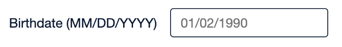
If you expect a user to input information into a field in a particular way, then you should let them know what you are expecting. For example, if you want their birth date entered in a particular format (ex. MM/DD/YYYY) then this format should be displayed somewhere near the input.
One of the easiest ways to show the user how you would like something formatted is to place an example in the field. This is called a placeholder. Below is an example of the incorrect and correct way to set up a field with proper formatting expectations.
Example:
Incorrect
A birth date field in a form that does not tell the user anything about how they should enter their birth date.

Correct
A birth date field in a form that has placeholder text to describe what the user should input into the field as well as a description in the label.
Required Fields
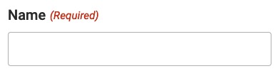
If you have fields that are required to be filled out, you must make this clear to the user. Using an asterisk and/or the word ‘required’ beside the field is enough to fulfill this requirement. Below is an example of an incorrect and correct way to set up a required field.
Example of a Required Field:
Incorrect
A required field in a form is only indicated by a colour change.
Correct
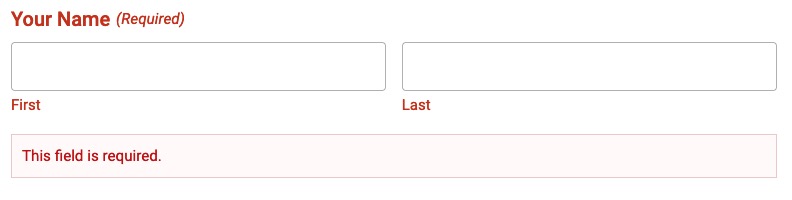
A required field in a form is indicated by the words ‘Required’ as well as a colour change.
Error Handling and Validation Messages
Error handling and validation messages are used to ensure that the user is aware an error has occurred or that a field has been filled out incorrectly. The WCAG 2.0 definition of “input error” says that it is “information provided by the user that is not accepted” by the system. In the event of an error, messaging should be as specific as possible.
For example, in the case of an unsuccessful form submission, the form should be re-displayed and should indicate that one or more fields have an error or have failed to validate. There should be a clear message at the beginning of the form to make sure the user is aware something has failed and what needs to be fixed.
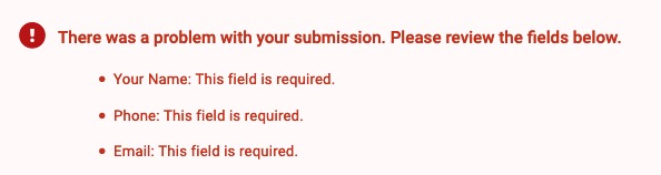
It is also best practice to make sure that the individual field inputs also display error and validation messages. If using colour to indicate an error, you must also make sure that text is displayed as well so that all users are able to properly understand the error/validation message.
Additional Resources for Developers
If you are a web developer or designer you may find these links informative to get a more technical knowledge of building accessible forms.
- Labelling Controls
- Notifications/Feedback
- Validation Input
- Success Criterion 1.3.1 – Info and Relationships
- Success Criterion 1.3.5 – Identify Input Purpose
- Success Criterion 3.2.2 – On Input
- Success Criterion 3.3.1 – Error Identification
- Success Criterion 3.3.2 – Labels or Instructions
- Success Criterion 3.3.3 – Error Suggestion