
Introduction
Ensuring your documents can be used by everyone is important, not only for the reader, but for you as well. Making your documents accessible from the outset reduces the need to translate them into accessible formats later on and allows you to reuse your documents regardless of who will be using them next. Microsoft Word has a number of tools to make documents accessible.
Text
Font eligibility is essential for accessibility. Use a font size of 12-point or above — anything smaller than 10-point font size is generally inaccessible. Try and keep font style consistent throughout the document. It is also recommended to use sans serif fonts such as Calibri, Trebuchet, Helvetica, or OpenDyslexic. Serif fonts typically have small embellishments at the end of the font strokes and can be difficult to read at certain sizes (e.g., Times New Roman, Garamond, and Harrington).
Colour and Contrast
- The colours you choose are an important part of your content creation as it can impact people that you’re not even aware have disabilities such as those with colour-blindness or low-vision impairments.
- Do not use colour alone to convey meaning or indicate importance.
- It’s better to indicate important concepts by using underlined or bolded text. Screen readers can detect these font features easily which will communicate the importance to the user.
Contrast Ratio
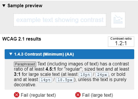
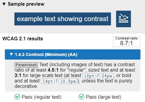
When text contrasts poorly with its background, it makes reading more difficult, especially for people with low vision. Ensure there is sufficient contrast between text and the background you are using i.e., a contrast ratio of at least 4.5:1 for normal text and 3:1 for large text. A light background and dark text or dark background and light text will typically achieve good contrast, however a Colour Contrast Analyser can be used to make sure the contrast is sufficient.
Contrast Fail Example
Contrast Pass Example
A very high colour contrast can make reading difficult for some people, especially those with dyxlexia. Choosing an off-white background colour such as cream can help reading in this case.
Spacing
Many people use the tab key, space bar, and enter key to organize their content. While the document may look good visually, using these tools to format a document can cause accessibility problems.
For example, every time you press Enter on your keyboard, you’re actually creating a new paragraph, even if you don’t add text to it. Screen readers can’t tell the difference, so the screen reader user is told that a paragraph exists in that space. The user is then left wondering if the document they’re reading is missing text, or if the screen reader has made an error. This can make reading your document a confusing and frustrating experience.
There are a few things you can do to prevent empty or blank lines appearing in your document.
Space After/Before a Paragraph
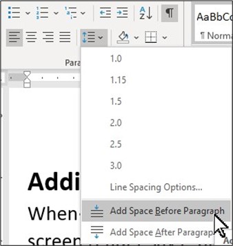
If you want to create space between your paragraphs, use the Add space after/before paragraph tool. This will increase the space between your paragraph without creating unnecessary empty lines.
Using the Add Space After/Before Paragraph Tool
- Select the paragraph or paragraphs you want to format.
- On the Home tab, click the Line and Paragraph Spacing command. Click Add Space Before Paragraph from the drop-down menu.
- The default spacing will be applied to your document.
Increasing the Space Size
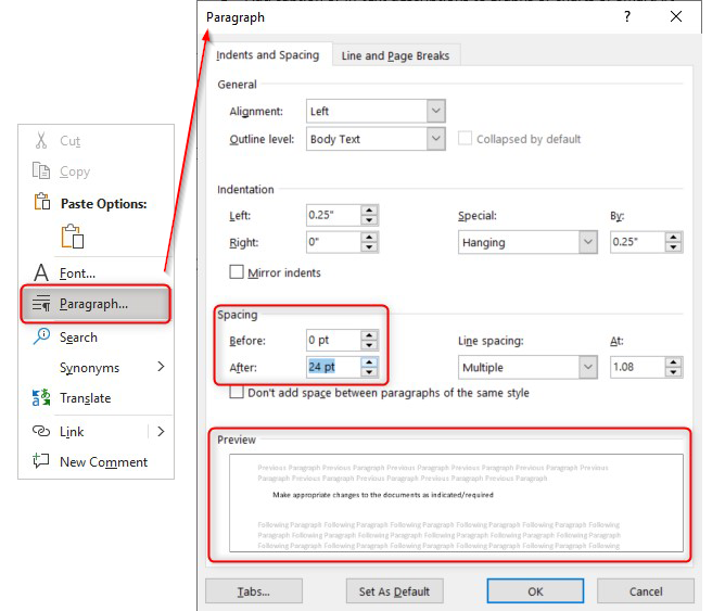
- Right click on the chosen paragraph and select Paragraph in the menu.
- In the Spacing section, click the up or down arrows to adjust the distance before or after the paragraph. You can also type a number directly.
- The Preview at the bottom of the properties window will provide an idea of how much space you are adding to your paragraph.
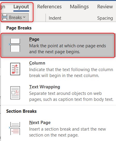
Page Breaks
If you want to start a new page, use the Page Breaks tools. This will automatically move your cursor/content to a new page without creating unnecessary empty lines.
- Select where you want a new section to begin.
- Go to Layout > Breaks.
- Click > Page.
Formatting View
If you are unsure if you have any empty lines in your document, turning on the document’s formatting view will highlight them for you.
To turn on formatting view:
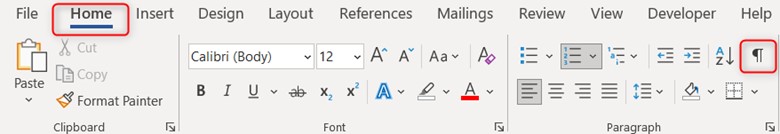
- Click on the Home tab in the ribbon .
- Click on the Show/Hide Paragraph button in the paragraph section.
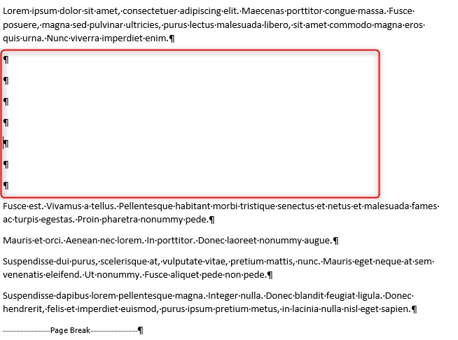
Formatting marks will appear in the document. If space has been formatted correctly, no content will be found in the space between paragraphs. If there are empty lines between paragraphs, these will be indicated with a Paragraph mark.
For example, the following screenshot shows the empty lines within a document. Once you have identified the empty lines, you can delete them and create the space you want using either of the steps above.
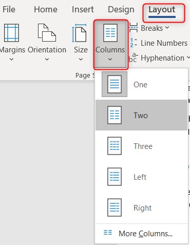
Columns
To make columns, use the Word Column function to create standard column and width spacing. Do not use spaces or tabs as these will not be recognized as a column by assistive technology.
To insert a column:
- Click on the Layout tab in the toolbar.
- Click Columns in the Page Setup box.
- Select the number of Columns you want and click OK.
Listed Items
When creating a list, use the Word Listing functions as opposed to typing numbers or dashes to denote list items. This make the content more accessible as screen readers can identify properly formatted lists and determine how many items are listed.
To create a list:
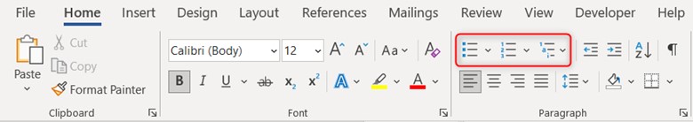
- Go to Home tab.
- In the Paragraph section, click either Bullets, Numbering, or Multilevel List options.
Styles and Headings
Styles are sets of formatting options (like font, line spacing and alignment) that you can apply to text. They allow a screen reader to navigate around a document. They also help communicate ideas in a concrete way for students with cognitive and organizational difficulties.
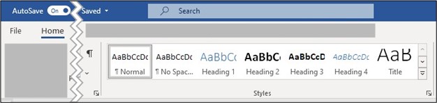
Styles in Microsoft Word are available in the home ribbon and can be applied by selecting the line of text you would like to apply it to and then clicking on the style you would like to choose. It’s important to note, that bolding and enlarging text is not the same as applying a style.
Customizing Styles
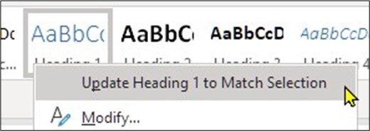
Styles can be customized in four easy steps:
- First format the text to your liking.
- Highlight the text in your document that you want designated as a particular style.
- Choose the style you want to apply and, right click it.
- Click Update <the chosen style> to Match Selection.
Any changes made to styles this way, will apply to all the text tagged as that style.
Headings
- Headings are a type of Style. They make it easier for all users to find relevant content in a long or complex document. The most used and important headings are Title Heading and Headings 1 to 3.
- The Title style should be used on the title page and then the other heading levels in the rest of the documents as required.
- Heading should always be used in a hierarchical manner. For example, a level 1 Heading should always come before a level 2 Heading. Do not skip levels.
- When using Headings, ensure that they all look differently to each other so that they can easily be distinguished i.e., Heading 1 looks bigger than Heading 2 etc.
Non-Text Content
Alternative Text
Alternative text, also known as alt text, is a text description of non-text content such as an image, chart, SmartArt, or other graphical elements in a document. When a person uses a screen reader or text to speech software, alt text allows them to hear a description of the non-text content. Alt text must be added to any non-text content that conveys a meaning or adds relevance to the document.
To add alt text:
Right click on the object and select Edit Alt Text.
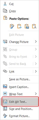
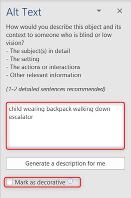
In the Alt Text pane, describe the object and its context. There is no need to add “image of …” before your description because the screen reader will indicate that it is an image.
If the image offers no information or meaning, select the Mark as decorative checkbox and a screen reader will skip it.
This article by Microsoft will help you understand how to write effective Alt text: Everything you need to know to write effective alt text (microsoft.com)
Position of Non-Text Content
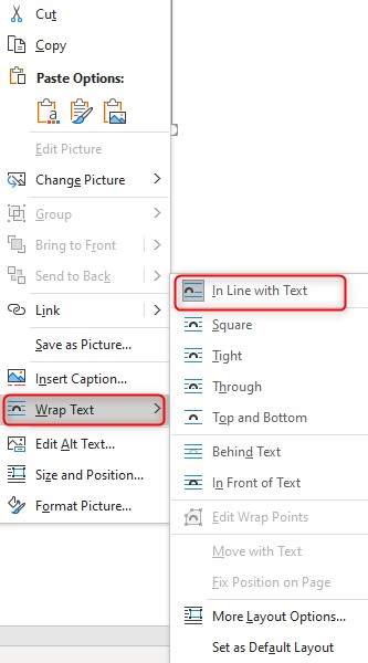
To ensure that screen readers to do not skip over any non-text content, the wrapping style of the object should be set as In line with text. This means the image is on its own line. From there you can position the image to the left, right, or center.
- Right click on the object and select Wrap Text.
- Select In line with text.
Graphs, Charts and SmartArt
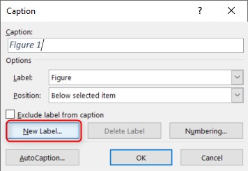
Alt text may not be sufficient to describe the information displayed in complex images such as, graphs, charts, and SmartArt. In these cases, figure captions or in-text descriptions can be used to provide longer descriptions.
To add a caption:
- Right click on the object and select Insert Caption.
- A default option for your caption will be generated. If you’d like to create your own select New Label and enter your caption into the pop-up dialog box.
Tables
Tables can create challenges for people using assistive technology.
To create an accessible table click Insert > Table and select the number of columns and rows you want by highlighting the grid.
Do not use the Draw Table tool as this makes it difficult for the table to be read by a screen reader.
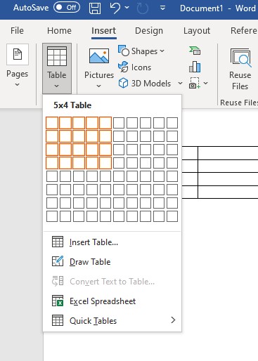
Table Structure
Use simple tables structures i.e., do not merge, or manipulate other table elements. Tables with merged cells can add considerable complications for screen reader users because it affects the reading order.
Table with merged cells
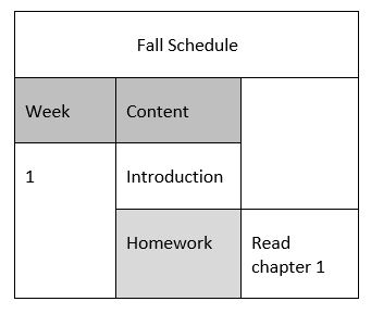
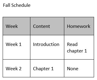
Table with unmerged cells
There are times when complicated tables are the best way to communicate information. When this happens, be sure to keep it as simple as possible or split the information into multiple tables.
Do not use images in tables.
Table Headings
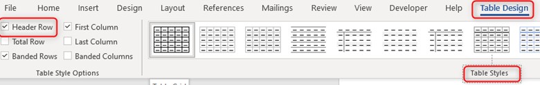
Tables should include a Heading Row. To add a heading row, click the table and go to the Design tab. Check the Header Row check box and choose a table style.
If a table is longer than a page, Heading Rows must be repeated at the top of the table on each of the following pages.
How to Repeat Headings Across Pages
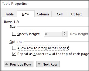
- Right-click the table and then click Table Properties.
- In the Table Properties dialog box, click the Row tab.
- Unselect Allow row to break across pages check box.
- Select the Repeat as header row at the top of each page check box.
- Select OK.
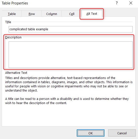
Table Alt Text
To add alternative text to your table:
- Right-click the table and then click Table Properties.
- In the Table Properties dialog box, click the Alt Text tab.
- Type a detailed description of the table, and describe the important details/message the table is conveying.
Hyperlinks
Hyperlinks are used to link your document to websites or other sections in your document. When using a hyperlink in a document, it’s imperative to use descriptive text that accurately describes where the link leads to. This is important for two reasons:
- Long confusing web addresses or non-informative phrases such as “click here” offer little insight to the average person about what it refers to.
- When a person who uses a screen reader encounters a URL, it will read every word and dash of the URL aloud making it confusing to follow.
Descriptive hyperlinks make it easier for the users to navigate and understand the reason for the link. You can add a descriptive hyperlink to almost all document creation programs.
Adding Descriptive Hyperlinks
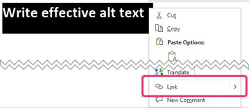
Select the text that you want to display as a hyperlink, then right-click on the text and click Link (or press Ctrl+K).
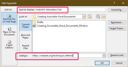
In the Insert Hyperlink box, type or paste the website URL in the Address box.
Add the descriptive text for your hyperlink in the Text to display box.
If you have pasted a website URL directly into your document, you can edit the hyperlink by right clicking the link and choosing Edit Hyperlink. Edit the display name by adding descriptive text to the Text to display box.
The newest version of the Microsoft Edge web browser automatic creates descriptive hyperlink text when copying and pasting from the browser. See the Improved copy and paste of URLs in Microsoft Edge article for details on how to use this feature.
Document Properties
Descriptive Title
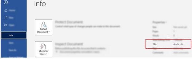
Adding a title to your document information allows screen reader users to preview document information without opening it. This can help limit the necessity of opening a document to determine if it’s the one they’re looking for.
To add a descriptive title, click File > Info. The title is located under the Properties section.
Meaningful File Name
Be sure to use a meaningful name for your document. This will make is easier for users to find. For guidance on how to add meaningful filenames and descriptive titles to your documents check out the Video: Create accessible file names (microsoft.com).
Accessibility Check
To check the accessibility of your document, use the built in MS Word accessibility checker tool. The article Using the Accessibility Check in the Microsoft 365 Office Suite explains how to use this tool.
Additional Resources
- Webaim.org – MS Word Accessibility
- Microsoft.com – Make Your Word Docs Accessible
- Accessible Documents Checklist: Microsoft Word
- Disability Answer Desk Support | Microsoft Accessibility
Note: These instructions apply to the current desktop versions of the Microsoft 365 Office Suite as of December 2021.