Welcome
If you’re feeling lost or are new to web accessibility, the following articles will help contextualize the content within this article:
- What is the AODA?
- Introduction to Web Accessibility
- WCAG 2.0 At a Glance
- Introduction to Writing and Formatting Content
- Writing Content
- Formatting Content
- Images and Icons
The information on this page has been written with web content creators in mind. In some cases, where we’ve determined that it’s important for you to understand how something works, more advanced guidelines have been included so you can make informed accessibility choices during content creation.
Who do these guidelines help?
- Users using screen readers or braille assistive devices.
- Users with sensory processing or learning disabilities.
Non-Text-Content
- Principle 1. Perceivable: Information and user interface components must be presentable to users in ways they can perceive.
- Guideline 1.1 Text Alternatives: Provide text alternatives for any non-text content so that it can be changed into other forms people need, such as large print, braille, speech, symbols, or simpler language.
- Criterion 1.1.1 Non-Text Content: The criterion is outlined below.
All non-text content that is presented to the user must have a text alternative that serves the equivalent purpose. Complex images like charts and graphs must have a text alternative that would fulfill the same purpose as the image. This criterion doesn’t just apply to charts and graphs. Other examples of non-text content include images, icons, audio and video, and animations. We expand on some of these non-text content types in other Web Accessibility Training series articles.
As images of charts and graphs are complex, only including alternative text is usually not sufficient. In most cases, providing a text alternative for complex images is a two-step process which includes brief alternative text and as well as longer description of the chart or graph nearby. Depending on the complexity of the table and the data contained within it, different methods of providing text alternatives may be used.
Learn more about alternative text in the Images and Icons article.
Examples of Charts and Text Alternatives
The following examples demonstrate how to meet this criterion, but there may be other methods of sufficiently achieving this criterion. Detailed information, as well as other techniques, can be found on the WCAG Non-Text Content page, or the W3C Web Accessibility Tutorials: Complex Images page.
Example 1: Alternative Text Only
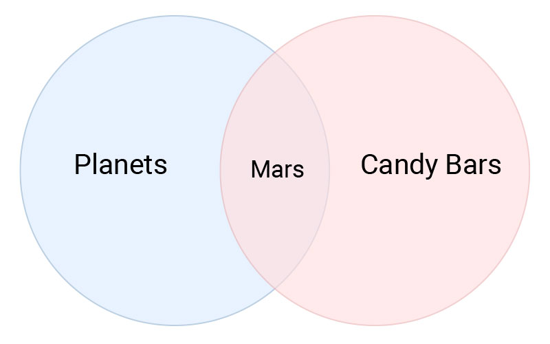
As with functional images, the alternative text in this example will describe the data rather than what the image looks like. Relating colour information is not important as it has no meaning.
Only using alternative text is sufficient as the chart is simple. Valid alternative text would be: “A Venn diagram depicting 2 intersecting circles. One is labeled ‘Planets’ and the other is labeled ‘Candy Bars’. The intersecting area is labeled, ‘Mars’.”
Example 2: Chart with Long Description
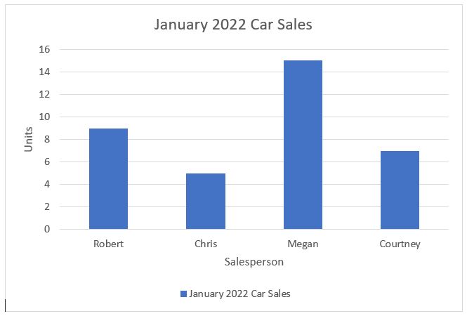
In this example, we will include brief alternative text describing the chart, as well as a longer description of the chart.
Valid alternative text would be, “Chart showing January 2022 car sales chart for 4 salespeople”.
Valid long description would be, “Chart of car sales for January 2022 shows Megan with 15 units, Robert with 9 units, Courtney with 7 units and Chris with 5 units sold.” This long description would then be included using one of the methods of how to include chart data/long descriptions.
Example 3: Chart with a Data Table
In this example, we will include brief alternative text describing the chart, and then add an accompanying data table which has built according to the accessibility guidelines in the Accessible Tables article.
Valid alternative text would be, “Chart showing ice cream flavour preference between chocolate, vanilla and strawberry among children, teenagers, adults and elderly.”
In this case, the chart data has been included as a separate table below the chart itself, however you could also place it on a separate page as defined in the methods of how to include chart data/long descriptions below.
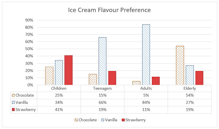
| Children | Teenagers | Adults | Elderly | |
|---|---|---|---|---|
| Chocolate | 25% | 15% | 5% | 54% |
| Vanilla | 34% | 66% | 84% | 27% |
| Strawberry | 41% | 19% | 11% | 19% |
Tip: Colour should not be used as the only method of conveying information in a chart. In the example chart above 3 different patterns have been used to help distinguish the different ice cream flavours. Learn more in the Colour and Contrast article.
Example 4: Pie Chart with List
In this example, we will include brief alternative text describing the chart. The chart data will be included as a bulleted list.
Valid alternative text would be, “Chart comparing how popular each type of household pet is: cats, dogs, birds and hamsters.”
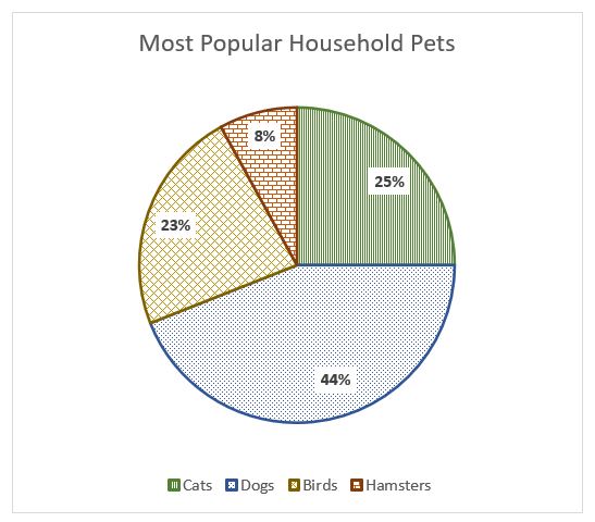
We would then include the chart information as a long description in bulleted list format. For example:
A pie chart showing the popularity of household pets:
- Dogs – 44%
- Cats – 25%
- Birds – 23%
- Hamsters – 8%
The long description would be included using one of the methods of how to include chart data/long descriptions.
Example 5: Flow Chart
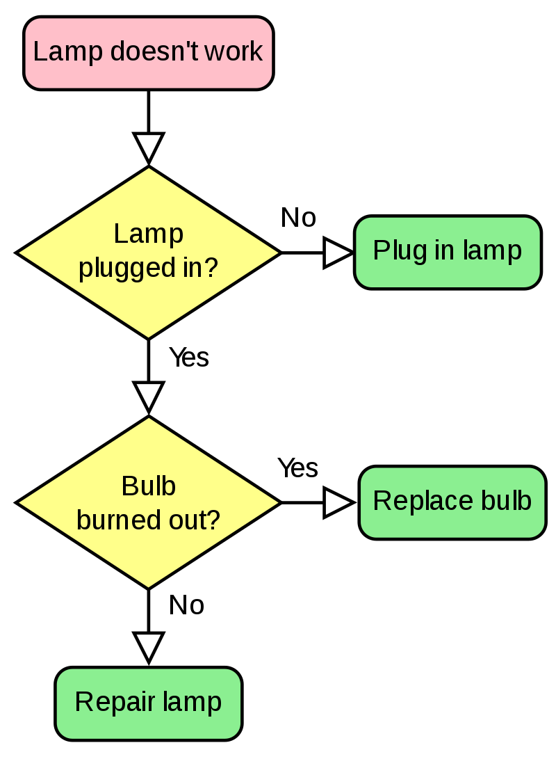
In this example, we will include brief alternative text describing the chart. The flowchart will be described using an outline list, using parent/children relationships denoted by nested lists.
Valid alternative text would be, “Flowchart about troubleshooting a lamp that doesn’t work.”
A valid long description with outline list would be:
The figure is a flowchart that illustrates the process of troubleshooting a lamp that doesn’t work. It starts with the statement, “Lamp doesn’t work” and moves through conditional questions to arrive at a conclusion.
- Lamp doesn’t work
- Transition to Lamp plugged in?
- Lamp plugged in?
- No. Transition to Plug in lamp.
- Yes. Transition to Bulb burned out?
- Bulb burned out?
- Yes. Transition to Replace bulb.
- No. Transition to Repair lamp.
- Plug in lamp.
- Replace bulb.
- Repair lamp
The long description would be included using one of the methods of how to include chart data/long descriptions.
Methods of How to Include Chart Data/Long Descriptions
There are three common methods including alternative chart data and long descriptions. For simplicity’s sake, the term “long description” is used in the methods below, but you might use the term “data table” instead, depending on how you decide to include the information (ex. long description, data table, bulleted list, etc.)
Method 1
Include the text, “Long description of chart below” directly below the chart, followed by the long description. If your CMS provides a caption feature for images, use it.
Method 2
- At the bottom of your page, create a section with the heading, “Description of charts on this page”.
- Add a sub-heading in the section titled, “Long description for January 2022 Car Sales chart” and include your long description.
- Include a link below your chart titled, “Long description of chart” which links to the description at the bottom of the page.
Method 3
If you have a lot of charts, you can create a separate webpage titled, “Description of charts” and place all chart descriptions on it, as long as you properly link each “Long description of chart” to the correct chart description.
Optional: Including “long description of chart below” in the alt text can be helpful to let users know additional information is available.


